 Forget Me Not
User manual · Chapter 4
The three views
The same reminders, read three ways: everything you keep, what is coming up, and a month at a time.
The itinerary
The itinerary is the list of everything you keep. Each row carries the reminder's category icon, its name, its next date and time, and a line summarising anything else worth knowing — a location, a repeat, how many notifications it has, whether it is paused.
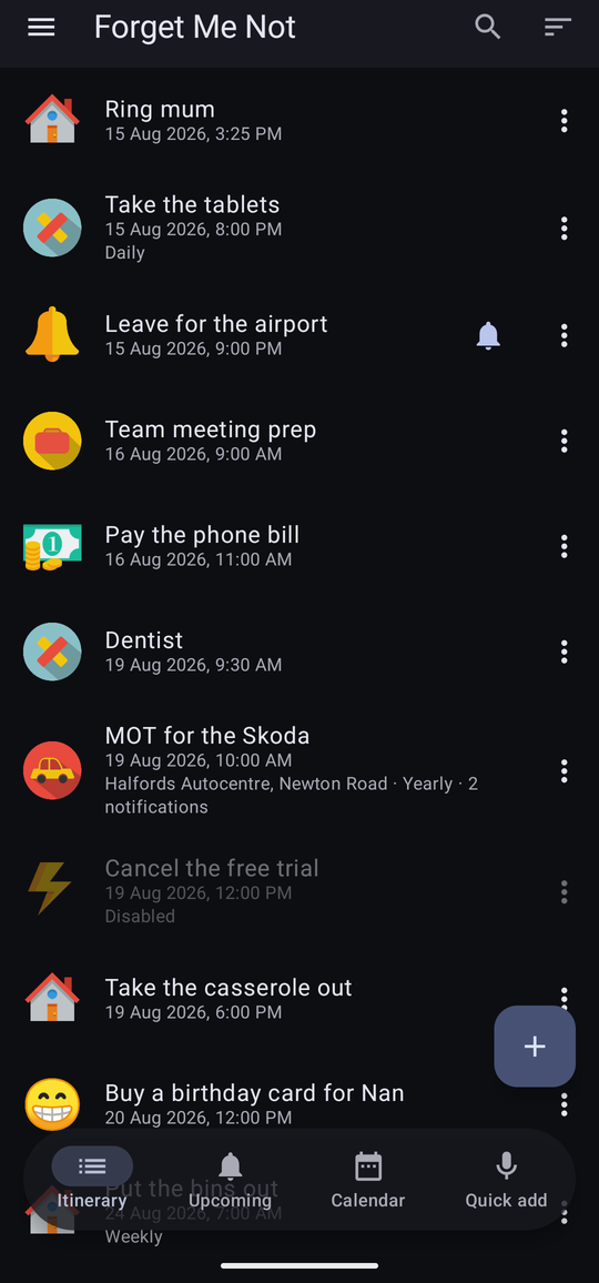
Tap a row to edit it; tap the ⋮ at its right for the row's own menu; long-press it to start selecting several at once.
Searching and sorting
Two controls sit at the top right of the itinerary.


Sorting by Category gathers everything of a kind together, which is a different question from “what is next” and often the more useful one when you are tidying up rather than planning.
Filtering by category
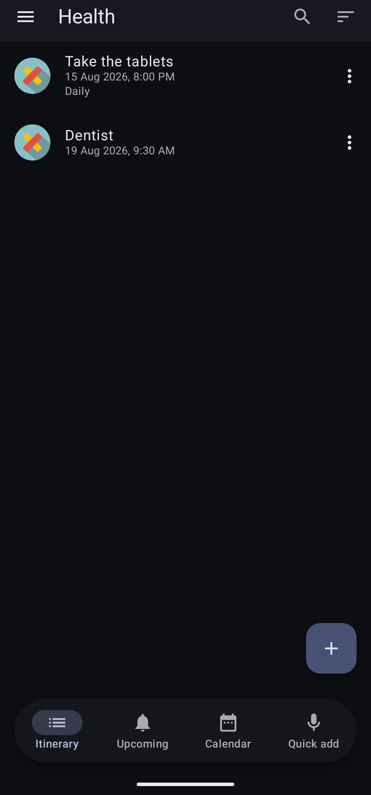
The drawer lists your categories with a count against each. Tapping one narrows the itinerary to it, and the title and the empty message follow — “No reminders in Alarms” rather than a blank screen. All at the top puts everything back.
Upcoming
Upcoming answers a different question: not what do I keep, but what is actually going to happen. It projects repeats forward, so a weekly bin day appears on each of the weeks in range rather than once.
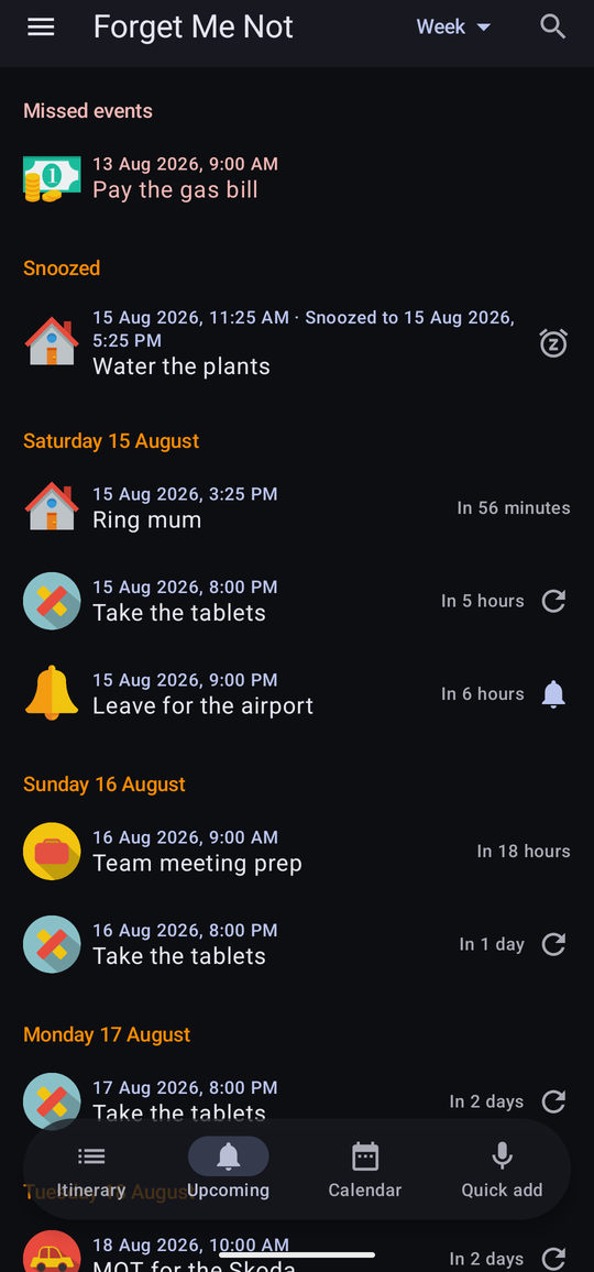
A plain row — neither missed nor snoozed nor delayed — says how far off it is, such as “in 3 days”, so the gap to the next thing does not need working out from the date alone.
How far ahead it reaches is set by the period control at the top right.

The headings change with the range: a day at a time over a week, a week at a time over a month, and a month at a time over anything longer. With nothing in range it says “Nothing upcoming in Week” rather than showing an empty list.
Missed and snoozed
Two sections sit above the days, out of date order, because they are about things that have already gone wrong rather than things that are coming.
- Missed events — reminders that fell due and were neither dismissed nor snoozed. They stay until you deal with them, and appear here even for reminders you have kept off the schedule.
- Snoozed — reminders you put off, each saying when it will come back: “8 Aug 2026, 9:15 AM · Snoozed to 8 Aug 2026, 11:00 AM”. A row put off with Delay before it ever fired carries its own, slightly different icon from one snoozed after firing, so the two read apart at a glance.
Missed events can be cleared out on a timer — see Delete missed events in Chapter 11 — so that a fortnight away does not leave a wall of them.
The calendar
The calendar shows a month at a time, with a count against every day that has something on it, and the plan underneath. Weekends are shaded. Today has a box round it.
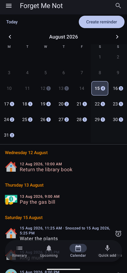
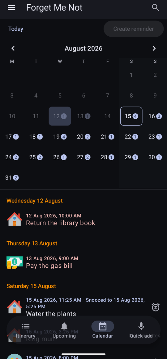
The arrows either side of the month name step back and forward, and you can swipe the grid instead. Today at the top left returns from wherever you have wandered to. Create reminder at the top right opens the editor with the selected date already filled in. A month with nothing in it says “Nothing this month”.
One occurrence
Tapping a reminder in the calendar's list opens that single occurrence in full: its time, how far off it is, its category, its repeat, its location, every notification it will give with the moment each one falls, and every field with its value.
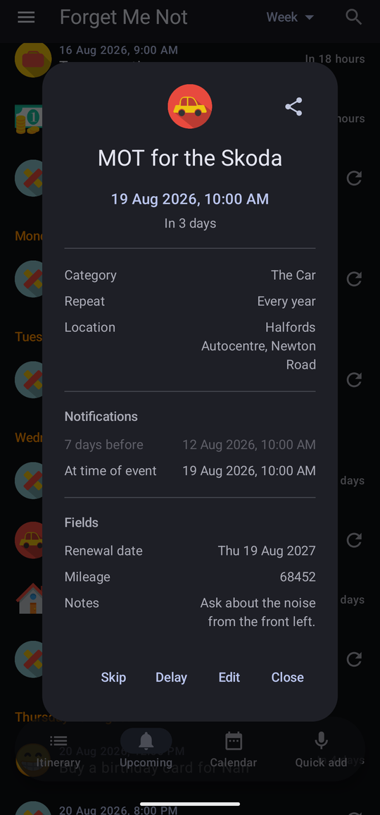
This is the screen to check when you want to be sure something is set up the way you think it is. A date field is shown as a date and a currency field with its symbol, rather than as the raw value.
The Fields section of this panel is part of Pro, so on Free it simply does not appear — this panel is a read-only summary, and there would be nothing to do with a greyed-out copy of it. The values themselves are untouched, and the reminder's own editor still shows you them under Pro Settings.
For an occurrence still ahead of you, a Delay button sits alongside Skip — see Chapter 5 for what it does and how it differs from Snooze.
Skipping a single date
Skip in that panel takes out one occurrence and leaves the rest of the series alone — the bin day you are away for, the tablet you have already taken. The app confirms: “Skipped — nothing will notify for this date. The rest of the series is unchanged.”
The occurrence stays listed, marked as skipped, and Don't skip puts it back. Nothing about the reminder itself is altered.
On a tablet
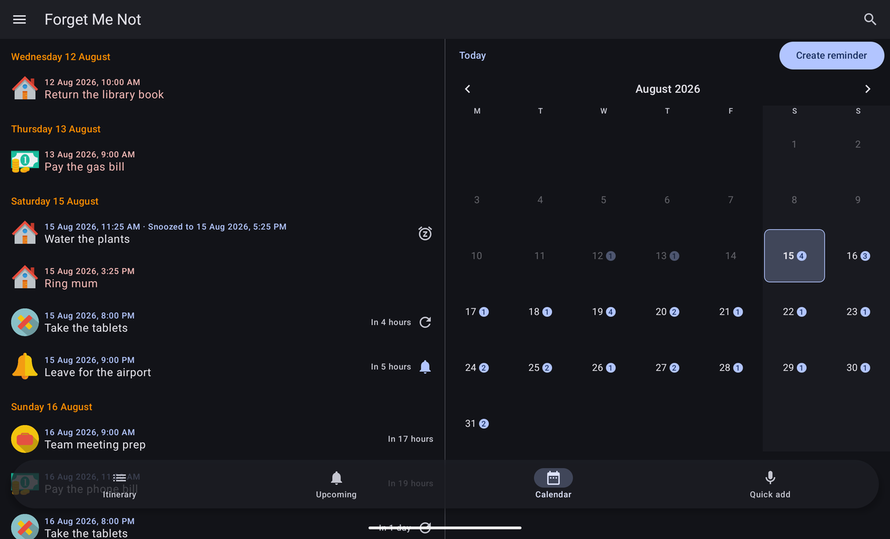
A tablet is not a stretched phone. In landscape the calendar splits: the day-by-day plan takes one half of the screen and the month grid the other, so a whole month and the detail of the next week are legible at once.
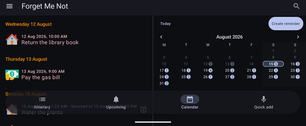
The same split happens on a phone turned sideways, where the room is scarcer and the gain larger.
The other views use the extra width for longer rows rather than wider gaps.

